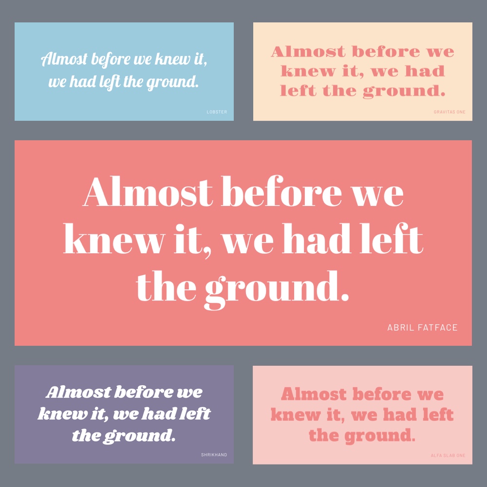
Let’s start by saying that I’m not a huuuge fan of Display and Handwriting fonts.
I will admit there are lots of beautiful fonts out there that I myself have fallen in love with, but if you look at the whole display/handwriting/fantasy vast world, there’s also a lot of bad stuff that I’d never recommend you use in your designs.
It’s a tough category, I’ll admit.
And the reason for that is twofold:
First, these are the kind of typefaces that often try to have a more “unique” personality. And that can get ugly very quickly.

But also, this desperate search for attention makes them less timeless, therefore making your design more prone to become obsolete or look “dated” in the future.
The second reason is that even then, these typefaces should still be able to fulfill their most fundamental purpose: to make a message readable.
And they are usually not my best choice for that.

That’s why if I ever decided to include a font from this category in a design, I would only use it in small parts of the copy and being extra careful to not compromise legibility, not even a bit.
Now to the Google Fonts collection.
That said, I dove deep into the dark world of the Display and Handwriting categories in Google Fonts, and put together a list of fonts that I believe can still be good choices for your designs when you need them.
Remember –and I can’t say this enough–, use them with judgement.
Beginning with 4 that I like a lot, and could even fall out of the Display or Handwriting categories if they wanted:
And now to the rest of the list…
So what do you think?
Would you use any of these in your work?


