I first ventured into web design back in 2010.
Ah, remember the ’10s?
[huge nostalgia moment alert]
Back in 2010 you didn’t get to watch a TV show when you wanted but when they aired it. We used CDs to listen to music, we didn’t stream it. DVDs were still the regular way to watch a movie at home. Smartphones weren’t the norm. Facebook was cool (we used to ask the people we met “Are you on Facebook?” ). I used to carry an actual printed map to get around. Fashion was all about skinny jeans, graphic tees, and UGG boots. YouTube was still the spot for viral videos. And AI was more of a sci-fi buzzword, reserved for futuristic movies where we thought robots meant clunky machines, not algorithms quietly making themselves an omelet behind the scenes.
[/close nostalgia moment]
Aaaanyway…
Another thing that was completely different in 2010 was typography in web design.
If you weren’t a web designer at that time you probably don’t know this… but we couldn’t just use ANY font on a website. We mostly had to satisfy all our creative aspirations with Web Safe Fonts.
These were typefaces that you would assume were installed as default fonts on the majority of devices. Which meant there was a pretty good chance of having your text appear as you intended on everyone’s computer.
And how many Web Safe Fonts were there, you ask?
Not so many.
We had the sans serifs Arial, Verdana, Tahoma, Trebuchet MS; the serifs Times New Roman, Georgia, and Garamond; and Courier New and Brush Script MT. At least these were the ones that looked best.
Yep, not fun.
So imagine the copious amounts of joy that I felt when Google Fonts made its debut that same year.
Suddenly we had an entire library of sexy typefaces that we could embed and use on any website – for free.
It was a pivotal moment.
Fast forward to today, Google Fonts has grown so much that most of us can’t imagine the web without it. There are 1700+ fonts available in their library, that are free and open source, including an expanding collection of variable fonts. They serve millions of websites worldwide. And you can use their fonts both on websites through their API or install them on your computer by downloading the font files.
And this is where this post comes in.
With hundreds and hundreds of fonts in the Google directory…
Are all of them worth our attention?
Are some of them better than others?
Are there fonts that are more “pro” looking than the rest?
Lucky for you, you don’t have to spend hours browsing the entire catalog (unless, of course, you want to – I won’t deny browsing fonts is by far my preferred way to procrastinate)…
Let me introduce you to my all-time favorite typefaces that you can find in Google Fonts – This time around: Serif edition.
These are beautifully designed. Super legible. Solid. Versatile. And a visual delight.
The Google Serif List

DM Serif Display
Ok, whoever said you should save the best for the end had no idea what’s what. Let’s kick off this list with one of my top serif fonts in Google’s collection: DM Serif Display.
Styles: 400 – Normal and Italic
Great for: Texts in larger font sizes
* For body text use DM Serif Text, another font within the DM suite that is more legible at smaller sizes.
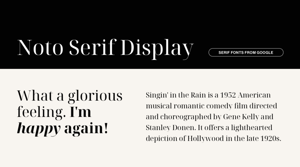
Noto Serif Display
Noto is actually a collection of fonts in itself, supporting more than 1000 languages (incredible, right?). It was designed with multiple weights and widths in serif, sans serif, mono, and other styles. The serif font (Noto Serif) also includes a Display style made for texts in larger font sizes – And it’s gorgeous. If elegance is what you’re after, this one could be the perfect choice.
Styles: from 100 to 900 – Normal and Italic
Great for: Texts in larger font sizes
* For body text use Noto Serif, designed to be more legible at smaller sizes.
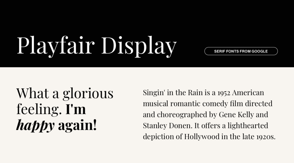
Playfair Display
How can you even make a list like this without including Playfair Display? It’s been in the Google font collection for a long time and it’s like it doesn’t age at all.
Styles: from 400 to 900 – Normal and Italic
Great for: Big texts and headings
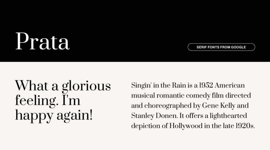
Prata
Prata is very close to my heart. Although it has only 1 weight available, it’s the font we’ve been using for our Pepper WordPress theme since it was born. And I still love it.
Styles: 400 – Normal
Great for: Big texts and headings
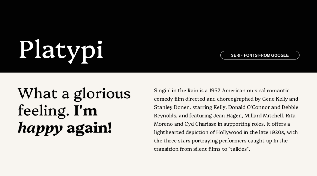
Platypi
More on the unique and distinctive side of serifs, we have Platypi. It works well in all sizes, but I’d use rather a lighter weight for small texts. Check out the Extra Bold style, it’s my favorite.
Styles: from 300 to 800 – Normal and Italic
Great for: Both body text and bigger titles

Literata
The Extra Light weight of Literata is why this font made the list. I mean, look at those lines. So delicate yet solid. It comes in several weights and styles and it has a very unique Italic design.
Styles: from 200 to 900 – Normal and Italic
Great for: Body text and bigger texts as well, but I like it the most in smaller sizes (and I’d use a weight between 300 to 600 for that to maintain legibility).
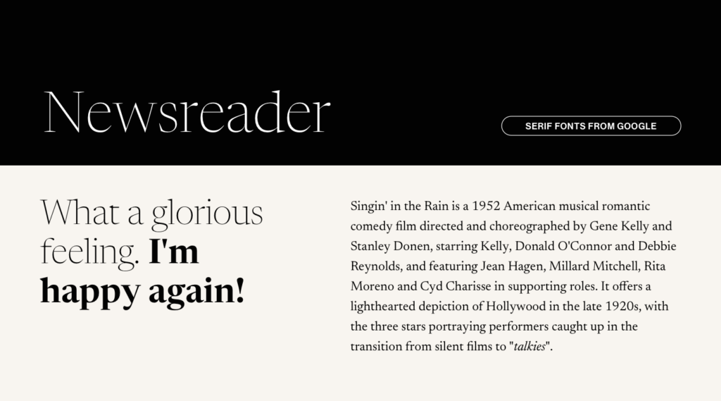
Newsreader
Another charming serif font for body text is Newsreader. The more I see it, the more I fall in love with it.
It has a more traditional vibe, although not as formal. And that makes it an exciting choice. I love that it’s wider and more circular. It looks beautiful in all weights and styles, and it’s super legible at all sizes.
Styles: from 200 to 800 – Normal and Italic
Great for: Body text and headings
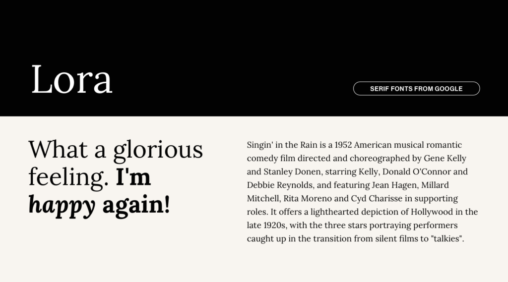
Lora
Here’s a typeface that I really like for body text. Lora is a solid serif font with a traditional yet a tad modern look, perfectly suitable for a blog post, an essay, or a delicious story.
Styles: from 400 to 700 – Normal and Italic
Great for: Body text
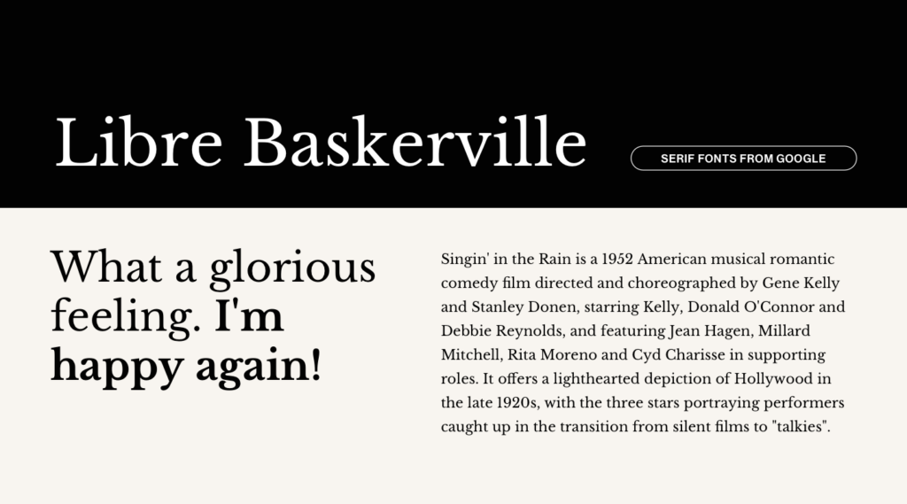
Libre Baskerville
A revival of the classic Baskerville (designed originally in the 1750s), Libre Baskerville is a font optimized for body text, with taller x-height, wider counters and a little less contrast (all of this equals = better legibility on smaller sizes).
Styles: 400, 400 Italic and 700
Great for: Body text
Alright, these ones will go without a full description but I couldn’t make this list without including the following fonts as well ⤵
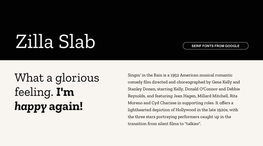
Zilla Slab
Styles: from 300 to 700 – Normal and Italic
Great for: Both headings and body text
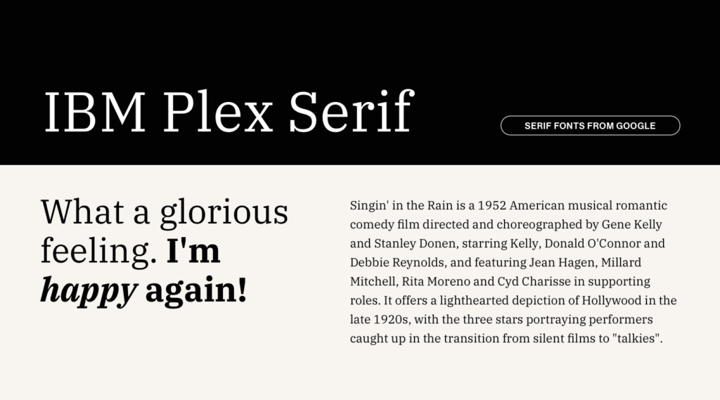
IBM Plex Serif
Styles: from 100 to 700 – Normal and Italic
Great for: Both headings and body text
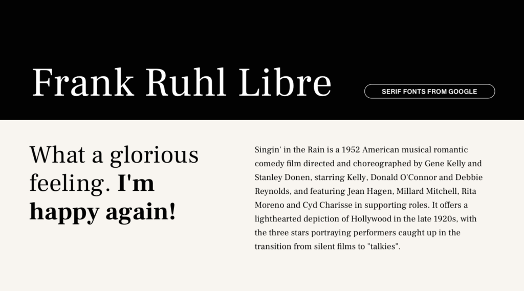
Frank Ruhl Libre
Styles: from 300 to 900
Great for: Both headings and body text

Source Serif 4
Styles: from 200 to 900 – Normal and Italic
Great for: Both headings and body text
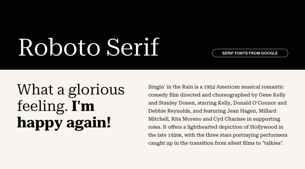
Roboto Serif
Styles: from 100 to 900 – Normal and Italic
Great for: Both headings and body text
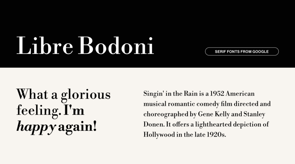
Libre Bodoni
Styles: from 400 to 700 – Normal and Italic
Great for: Headings
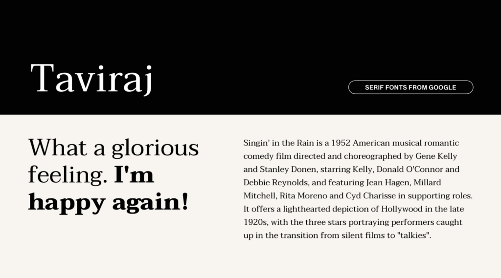
Taviraj
Styles: from 100 to 900 – Normal and Italic
Great for: Big texts and headings
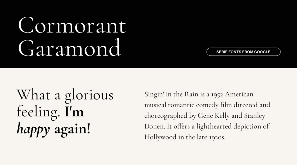
Cormorant Garamond
Styles: from 300 to 700 – Normal and Italic
Great for: Both body text (although not in a very small size) and headings
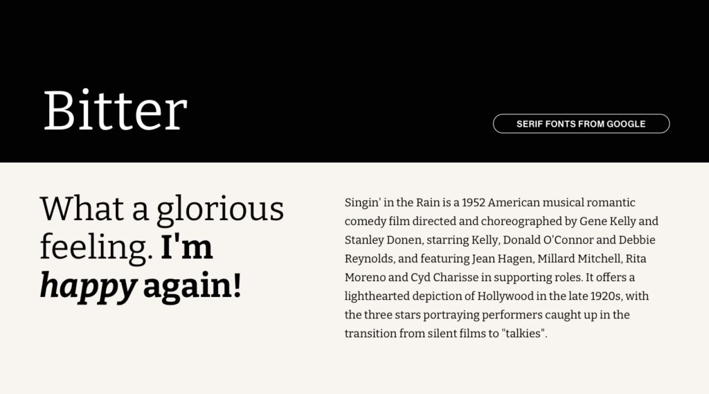
Bitter
Styles: from 100 to 900 – Normal and Italic
Great for: Both body text and headings
And there you have it — My personal roundup of the most beautiful, versatile, and reliable serif fonts from Google Fonts.
Whether you’re working on a sleek modern project, a traditional piece, or anything in between, these typefaces will have you covered with their timeless and solid design.
And as if that wasn’t enough they’re free, so you can start using them right away. Go ahead, experiment, mix, and match. Nothing elevates a design like having the perfect font on it 🚀
Have a favorite that’s not on the list?
Drop it in the comments, I’d love to know about it!
Featured Image Credit: Lummi

